
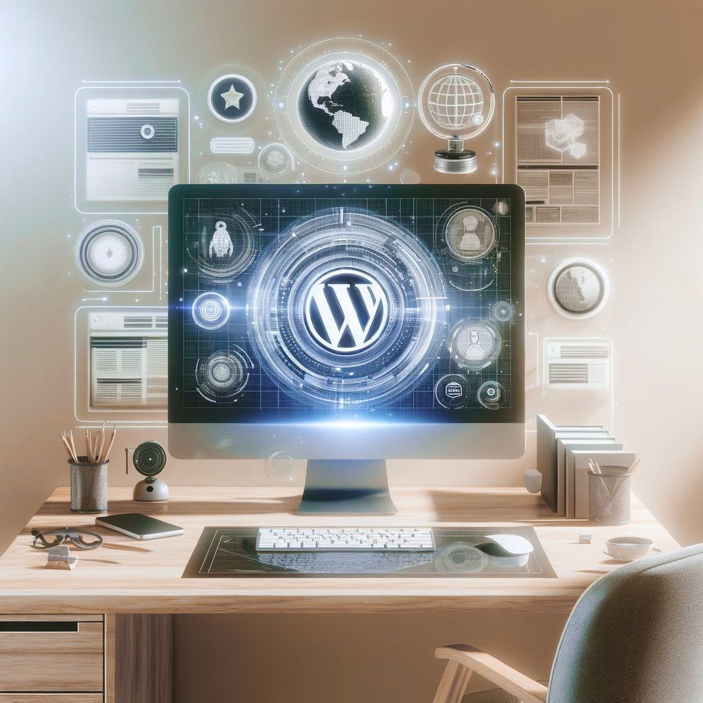
In today’s digital age, adapting an adaptive web page for mobile devices is crucial for attracting and retaining an audience. Mobile devices are the primary means of accessing the internet. Your website should be optimized for various devices, ensuring users have a seamless experience.
WHY IS A MOBILE-RESPONSIVE DESIGN ESSENTIAL?
An adaptive web page design isn’t just a trend; it’s a must in our globally digitized era with the rapid rise of mobile networks. Making your website mobile-friendly is an intuitive approach. It allows your site to automatically adjust to various screen sizes (like mobile phones, tablets, and computers).
- User-friendly: Adapting a website for mobile devices goes beyond text readability and content accessibility. It considers diverse device features, offering a comfortable and personalized viewing experience. Incorporating interactive elements and user-friendly navigation improves the user experience, helping retain visitors on your site.
- Growing mobile user base: Every day, vast numbers choose mobile devices for web access. Data shows the mobile user segment is rapidly growing, even overtaking desktop stats. Hence, it’s vital to have a site that effectively and attractively displays across platforms, essential for drawing and retaining mobile viewers.
- Search engine favorability: Google and other major search engines lean positively towards sites with optimized mobile designs. This preference is included in ranking algorithms, directly impacting your site’s visibility and search result ranking. Recently, there’s a special emphasis on mobile responsiveness. Investing in an adaptive web page design means investing in your SEO.
Optimize your website, focusing on adaptability and usability. This will attract and retain your target audience, giving your business a boost in search engine rankings, enhancing your online presence, and strengthening your market position.

HOW DOES ADAPTIVE WEB PAGE DESIGN WORK?
- Adaptive settings mean the site can “adjust.” It can be convenient on any device, whether it’s a phone, tablet, or computer. This is achieved through flexible grids. Imagine your website as a picture that can stretch or shrink. This picture always perfectly fits the frame (device screen).
- Design adaptation for mobile devices helps your site “get along” with all devices. It ensures a comfortable interaction for every user. Visitors using a phone or tablet can easily find the information they need, read content, or tap on a user-friendly button. In short, adaptability isn’t just a trendy term; it’s a real necessity for modern websites. If you want satisfied users who actively engage with your site, adaptive settings are a must!
BENEFITS OF SITE ADAPTATION: SIMPLE AND CLEAR
- Always Connected: Your site works on any device. In times when the internet is always at hand, people want to use your site freely – anywhere, anytime. You grant them this freedom and grab their attention. You increase the likelihood they’ll take actions favorable to you. This creates meaningful engagement with your brand.
- Ease = High Conversion: Simplicity for your customer. When your site’s design isn’t just attractive but also user-friendly, it magnetically draws visitors’ attention. It nudges them towards action and guides them on the journey you’ve envisioned. This strengthens your bond with clients and boosts their loyalty.
- Ready for Tomorrow: Your site is in sync with tech innovations. In the rapidly changing tech world, an adaptive web page design is your personal insurance. Your website will remain relevant and competitive in the future. It’s how you maintain your stance in the digital realm. It ensures your brand’s continuous online presence.
CONCLUSION
In simple terms, adapting a site for mobile devices ensures your brand is always accessible, convenient, and relevant to all users. It offers independence from their device or location. The chance to always be close to your audience and provide them the best interaction experience with your site. This way, we increase loyalty and boost conversion. It’s not just about aesthetics; these are key aspects for effective SEO optimization. It’s a chance to improve your site’s visibility in search engines. For perfecting your resource, you can always turn to SiteDesign.


